Almost a month ago, the University, as part of its “Boundless Possibility” strategic plan, unveiled its new Branding Center which outlined updates to Rocky, the seal, school colors, and — most controversially — the logo. Student reactions to the logo have been far from glowing, with many expressing a clear preference for the previous design. But what made the old logo so special? Is the new logo truly that bad, or are students just uncomfortable with sudden change?
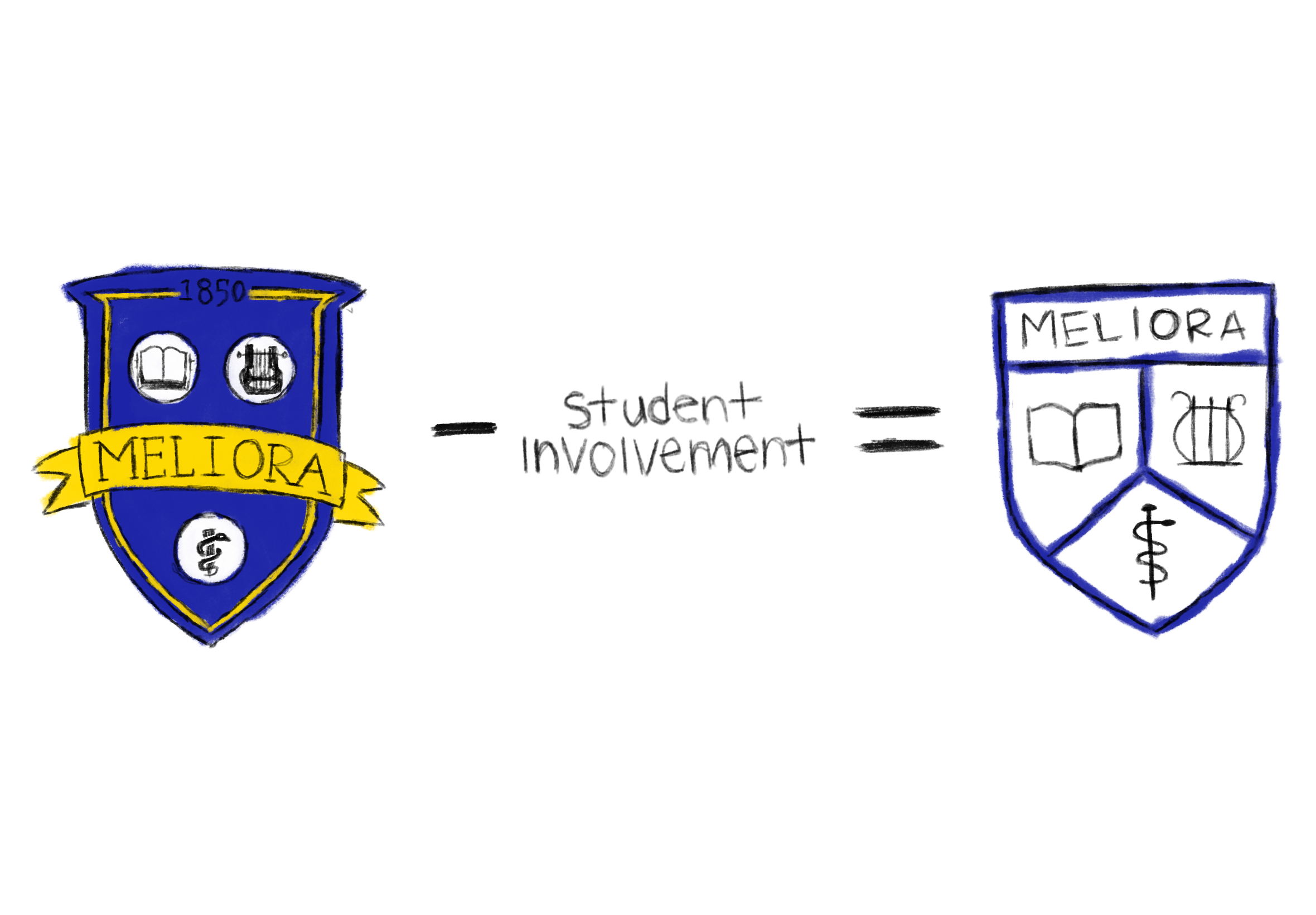
Backlash against a logo change isn’t new — students also grumbled in 2007, the last time the logo was reworked. But the process of selecting a new logo 18 years ago was very different than it was this most recent time around. That time, it stretched over a year, during which the University made an explicit effort to deeply involve the community in the redesign by organizing open forums, student government collaboration, and even a public vote that drew more than 10,000 responses. By contrast, this year’s rebrand materialized from nowhere in many students’ eyes. Most students learned of the switch only after it launched. This difference in process — not just in design — may explain why today’s reactions have been so much louder.
The initiative to change the last logo was first communicated to the University community in Sept. 2006 — more than a full year before the logo was formally unveiled. Then–University President Joel Seligman had made clear from his hiring in 2005 that one of his top priorities was to begin “strategic planning” to increase the University’s prestige and national visibility. Sound familiar? By late 2006, a report requested by Sliegman from one of his former colleagues at WashU was finalized, laying out 15 ideas for change, one of which was a “University-wide Identity and Branding Project.” Then–Vice President of Communications Bill Murphy was chosen to lead this venture. In the spring of 2006, Murphy put together a team of experts from within the University consisting of “28 people with experience in publications and web design including 10 graphic designers” who would be tasked with designing a new logo.
It’s important to note that, at this point, the University didn’t really have a designated logo. There was the University Seal, designed in 1928 and refined in the ’80s, but this design was too ornate to be shrunk to business-card sizes and too austere to reflect school spirit for athletics and student organizations. Sports teams could use URBee, Rocky’s predecessor, but many teams found the mascot too cutesy. Eastman had its own logo, which was more in line with the 21st century, but it was so different to UR’s logo that prospective students often didn’t know that Eastman and UR were part of the same institution. Similarly, many departments and libraries had opted to create their own logos, only furthering visual confusion. It was clear that something needed to change.
During the summer of 2006, Murphy and his team conducted thorough research as they started the logo redesign. The team coordinated a presentation from the University’s archivist to ensure they were educated on University heritage and culture, and most importantly, sought out student input. “At one point, we had 229 different designs up on a wall in Wilson Commons for people to react to,” Murphy said, according to an archived Campus Times article titled “UR seeks new graphic design.”
Murphy and his team, in conjunction with the Student Association, held a town hall to discuss the logo Sept. 27, 2006 in the Gowen Room of Wilco to gauge student opinions on the selection of 12 possible logos that the team had decided were most promising over the summer. Murphy told the CT that the students were “high energy, which is good,” but that most of the comments were “frankly negative.” Still, Murphy was not discouraged: “We remain a lot more true to who Rochester is if we listen to all the different voices.” The article also claimed that the logo would be finished by December of 2006 and that the full graphic identity would be complete by the following September.
Clearly this was not the case: In another town hall Feb. 21, 2006, President Sliegman spoke at length about the strategic planning initiative and defended the ways that the University was spending its money.
“This is not something that we are going to decide on this year, and then again next year and the year after that,” Seligman reportedly told the crowd. “The new logo is likely to be the identity of the University for decades.”
Murphy also explained during the meeting how he saved money on the initiative by using University employees rather than an outside consulting group which had cost other schools like Rutgers hundreds of thousands of dollars.
Interestingly, the CT hinted that Murphy had recently been given overwhelmingly negative feedback to his logo designs, reporting that “‘Things have changed since this morning,’ Murphy said. ‘We take the feedback very seriously.’” CT did not publish any student opinion pieces on the logo at this time, nor did it elaborate exactly what happened that morning that caused “things” to change. Even so, this article seemed to suggest that Murphy may have tried to push a new logo too early, potentially in an effort to expedite a decision that was already two months overdue.
If it is the case that Murphy did try to push a final logo too soon, he did not blame students or try to justify an unpopular logo, but instead made the difficult decision to walk back his plans and listen to the community. According to a CT interview with Alex Pearlman, then–SA President, “Bill Murphy is so interested in not only this project, but any project that involves students.” Pearlman also emphasized how much Murphy “cares for the student body.”
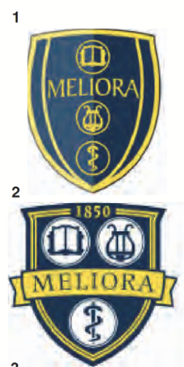
In March, a community-wide vote was announced in the CT by the University Office of Communications. According to the announcement, feedback would be used to “help decide which logo will be selected by the end of the calendar year.” Although Pearlman and Murphy communicated that students were excited by the change, not everyone was so happy. One disgruntled alum wrote to the CT indicating that he was unhappy with all five choices, comparing Eastman’s lyre to a ladybug and the shield shapes to “southward-pointing breasts.” The piece itself was clearly humorous, but it indicates that perhaps some students saw the redesign process as frivolous and the choices as unappealing.
The survey ended up receiving more than 10,000 votes and was open to alumni, faculty, staff and students. For comparison, the 2025 redesign campaign in its entirety involved less than half as many community member responses and no public vote. Design two was chosen with not just a plurality, but a majority of votes, and, after some tweaks, was finalized as the new logo.
By September of 2007, the logo was finally ready for its public 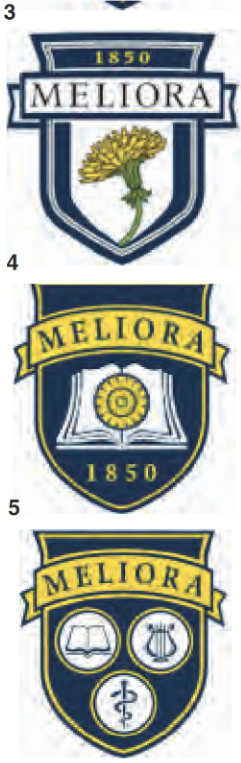
 unveiling in the week leading up to Yellowjacket Weekend festivities. The unveiling ceremony included a performance by the pep band, free cookies and keychains, and even T-shirts thrown into the crowd. Within a week, the new logo was applied to webpages, apparel, and flags around campus. The CT article reporting on the celebration also hinted at a future initiative to redesign URBee, which eventually culminated in public votes on the design and naming of Rocky.
One issue of UR’s magazine, theRochester Review, published just after the redesign, lays out the University’s motivations behind the change. It also reiterates the cost-saving decisions carried out by the design team. “One option was to hire a consulting firm,” the article reads. “That’s what Rutgers University did — at a hefty price tag. Rutgers paid its consulting firm $570,000 [for its rebranding initiative].”
The article also includes quotes from figures involved with the process including Murphy, the incoming SA president, and the Associate Dean of Students, Anne-Marie Algier.
“How the University is represented is important to students, and their turn-out showed that,” Algier said in the article. The article continues to report that “Algier says that students preferred a logo denoting a ‘dignified, serious research university. They didn’t want it to be contemporary. They were more conservative than I thought.’”
Algier, who now serves as the Dean of Students, shared her recollections of the 2007 process.
“It took a lot longer to get there … to bring people to consensus around [the new logo],” Algier shared. “It was a longer and lengthier process, probably, than they originally had thought.”
Algier also shared that she had been involved as the advisor of the student government at the time, and worked closely with SA President Pearlman and his peers to make sure student voices were involved.
This idea was echoed by Pearlman himself, who I also consulted for this story.
“When I ran for SA president, the platform that I ran on was that the role of student government was to be an intersection between students and administration,” Pearlman recounted. “ I said there should be one voice for students: student government.” Pearlman explained that the logo and mascot rebrand were both “early tests” of his plan to shift the role of SA.
Another major piece of the plan was Murphy himself. According to Pearlman, Murphy was “very agreeable to welcome student feedback.” Algier similarly said that she loved working with Murphy and emphasized his desire to hear feedback from across the University’s different schools.
Pearlman did not remember any particular student outcry during the earlier half of the research process. “I don’t recall any movement of pushback,” Pearlman stated, though he clarified that “I imagine there were people who expressed concern through the focus group.”
Algier noted that, although “most people were happy with the [2007] logo,” the real friction came in once the logo was in use. “After they [released the logo], it got really strict as far as what you could do and not do.” Algier said, noting, “that was hard. That was when I had a little pushback from students.”
One likely reason for the lack of student outcry in 2007 is how involved students were in the process. “There was a desire — from the student government perspective — to bring students into the conversation,” Pearlman said. “And then there was a reception from the administration that they were perfectly happy to do it.”
Somewhat surprisingly, Pearlman isn’t unhappy with the new logo, despite the fact that it has replaced much of the work done during his final term as SA President. To him, it feels like “a business decision that the University made,” and he feels neutrally towards it. “The first thing I did [when I saw the announcement] was look at the mugs and shirts I had and be like, ‘Well these are outdated.’”
To Pearlman, the biggest issue with the 2025 rebrand isn’t the logo itself but how they handled student involvement. “My management background is in changing culture so engaging stakeholders is a critical part of that,” he said. “Generally speaking, the logic is that the more involved stakeholders are, the more likely the change is to stick.”
Algier, however, wanted to clarify that an effort was made to involve students. “There are times when … we think we’ve done all we can [to get student opinions],” she said. “We’ve talked to students, we’ve put it out there, I might even talk [to the Campus Times] and you’d do a story … Then [we release it] and everybody’s like ‘Where’d this come from?!’,” Algier said exasperatedly. “Sometimes you can’t win.”
What’s the takeaway? On the one hand, it does seem obvious that students were not nearly as involved in the recent rebranding initiative as compared to 2007. But on the other hand, the more recent changes were not intended to be as large of an image shift. Algier noted that, in 2007, “we were really trying to create a logo whereas this time it was [moreso] refreshing that same logo and sort of digitizing and simplifying.” It looks like the new logo isn’t going anywhere. So, what is the next step forward for the University to show students that our voices are still important to them? When I asked Algier about possibilities for future student involvement, she said she wasn’t aware of any at the moment but that she thinks that Page Hetzel, vice president for marketing and communications, and the Boundless Possibility team that she leads would be “very interested in partnering with students — and others too,” in future parts of the rebranding process.