When I was born in Strong Hospital in 2002, I was likely carried home through doors with an unfamiliar logo. It was black and white, intricate, and hard to remember. But by the time I turned five, something special happened on campus: in coordination with students, faculty, staff, alumni, and community members a new logo was created — one that was easily recognizable from a distance, sporting our signature blue and yellow and proudly emblazoned with a golden banner that read “MELIORA.”
Since then, that cheerful logo has always been around me. Every time I logged in to play Club Penguin in my dad’s office, this was the logo on his browser homepage. When my dad got tenure in 2009, this was the logo on the envelope sharing the news. When I broke my arm in 2010, this was the logo above the pediatric emergency department door. When I received my acceptance letter in 2021, that logo welcomed me to my new home for the next four (later five) years.
I imagine that people with less backstory on this campus might be unimpressed with my melodramatics. It’s just a picture, after all. Have I really fallen in love with a piece of marketing propaganda? But, I would argue my issues with the rebrand are deeper than pure nostalgia.
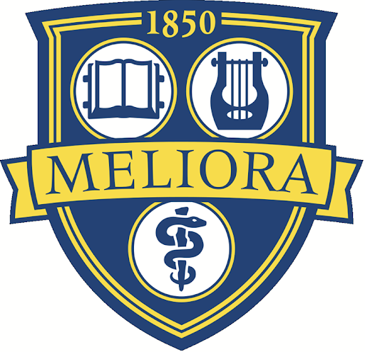
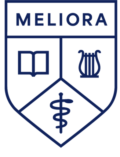
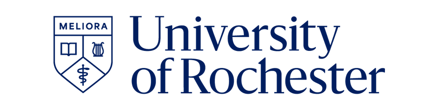
The former (left) and new (right) logo.
Most obviously, it’s erasing our history as a school and downplaying the humanities aspect of our identity. Looking at these logos side-by-side and top-to-bottom, the first change I notice is the removal of 1850, our year of founding. The new logo, with its uniform line weight, simplified graphics, and sans serif type, communicates an almost corporate identity. This new logo is akin to that of a startup from 2014, and is far from reflective of the beautiful, ivy-covered campuses that drew many of us to the University in the first place.
This is also clear in the simplification of the icons representing our three main campuses. Instead of a literary tome, the new logo sports a simple book — perhaps a magazine. The Greek Lyre has been replaced by what looks like a peculiar beetle. Rather than a gnarled Rod of Asclepius, the redesign has opted for a shoelace wrapped around a knitting needle.
And this isn’t just my opinion. When I discussed the logo with my graphic design professor, Nancy Bernardo, she had similar observations. One of the first things she noticed was how “pared down” it was.
“It’s just stripped down from its original form,” Bernardo said, adding that “The [new] logo seems a little more like a sketch. It lost a little bit of its personality.” She also pointed out the change in the typography of the wordmark — the text that sometimes appears beside a logo. Bernardo discussed how the thick typography, comparatively tall lowercase letters, and lack of variety in line weight within the font made the wordmark feel “heavy” against the frail-looking new logo. That, in her opinion, communicates a lack of sophistication that was present in the old wordmark.
However, Bernado wasn’t quite as attached to the old logo as me. “I do think the old logo’s a little busy — a little fussy,” she stated. “But it also has an elegance to it … I think it could easily be updated contemporarily and still have more detail.”
I think that level of detail is what I keep coming back to. I’m a mechanical engineering major, so I do appreciate UR’s cutting-edge facilities and ground-breaking research in the STEM fields. But, I am also the daughter of a history professor and an avid proponent of the cluster system. The truth is that the modern, techy, quality of the new logo downplays the non-scientific aspects of our university.
In my opinion, this logo showcases the worst of what goes on behind the scenes of this school. The simplified lines and symbols communicate a sense of obsessive optimization done at the cost of the smaller beloved programs. The removal of detail and nuance from the old logo reflects the way the University has been reducing budgets and faculty counts in its smaller departments since long before the pandemic.
The uncanny similarities between our new logo and Cornell University’s reflect how admissions loves to proclaim UR a “Hidden Ivy,” but seems to be more focused on appearances than nurturing our campus culture. When I heard the rumor that a monochrome logo was chosen because the old one was too difficult to place on certain color backgrounds, it felt reminiscent of our harsh new protest policy, which arose because apparently free speech clashed with certain parts of campus.
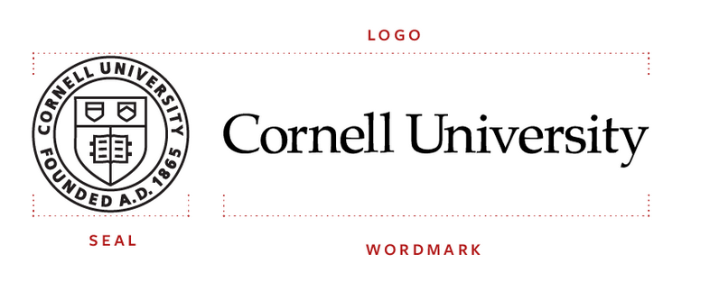
 Cornell University’s branding and the University of Rochester’s branding in a side-by-side comparison.
Maybe I’m being a little bitter. If anything, the student body’s overall negative reaction to the new logo proves how comparatively good the old one was. I’ve talked to more than 50 students about their feelings on the logo change, and several ideas about the old logo are recurrent: It feels like it fits our university, it reminds students of what we love about this campus, and it makes us feel proud to be students here.
The most frustrating part of it all, though, is how blindsided I feel as a student. I don’t feel like any effort was made to ask for my input on something that I’ve come to realize is deeply personal to me. What’s worse is that, the more I look into the 2007 redesign and the effort that was made to include student voices, I just feel a sense of resigned melancholy at what could have been. I originally wanted to end this piece stating that there’s still time — that there’s still a chance to make further redesigns and involve the students, faculty, staff, and alumni in these changes, but I’m not optimistic. Instead I’ll say this: students and alumni are screaming that we genuinely like the old logo, and that kind of brand loyalty is hard to come by. I would suggest the University think long and hard before they let our old shield go.