
The University announced a new set of logos and other branding elements as part of an overhaul of their branding and marketing strategies Oct. 2.
Since 2023, the University has been planning a new marketing campaign as part of the “Boundless Possibility” strategic plan, aimed at elevating and building the University’s profile on a national scale.
While the new logos have been met with some mixed reviews from students on campus, Page Hetzel, Vice President for Marketing and Communications, explained that this campaign is more than just logos.
“A brand is not just a logo,” she said. “It’s actually more than that. It’s the strategy. It’s the story of who we are.”
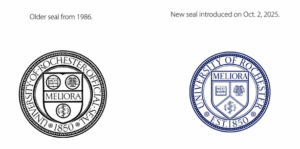
Hetzel also clarified that, as before, the logo will not appear in formal settings, such as diplomas. In these instances, the University’s seal will be used, which reflects minor changes.
Hetzel said that the University has not updated its logo in nearly 25 years, and that this version was designed largely for print production. In the digital age, the University needed a logo they could manipulate online.
“Our marks haven’t been updated since before the iPhone [in 2007],” Hetzel said. “So the way we communicate [now], everything is completely different, and our current system, really it’s not accessible, it doesn’t work in digital.”
Nancy Zawacki, Director of Brand Marketing, said that UR gave some students, alumni, and even the general public a role in the research process.
“I think there were probably about 4,500 people who were part of this process in the research [behind the campaign], including four rounds with students.”
In addition to the new logos, the University also released other branding elements including photography and videography style guides and a new color palette.
“We’re keeping our traditional colors, but we added a whole bright spectrum because we were told again and again students … love the brighter colors,” Zawacki said.
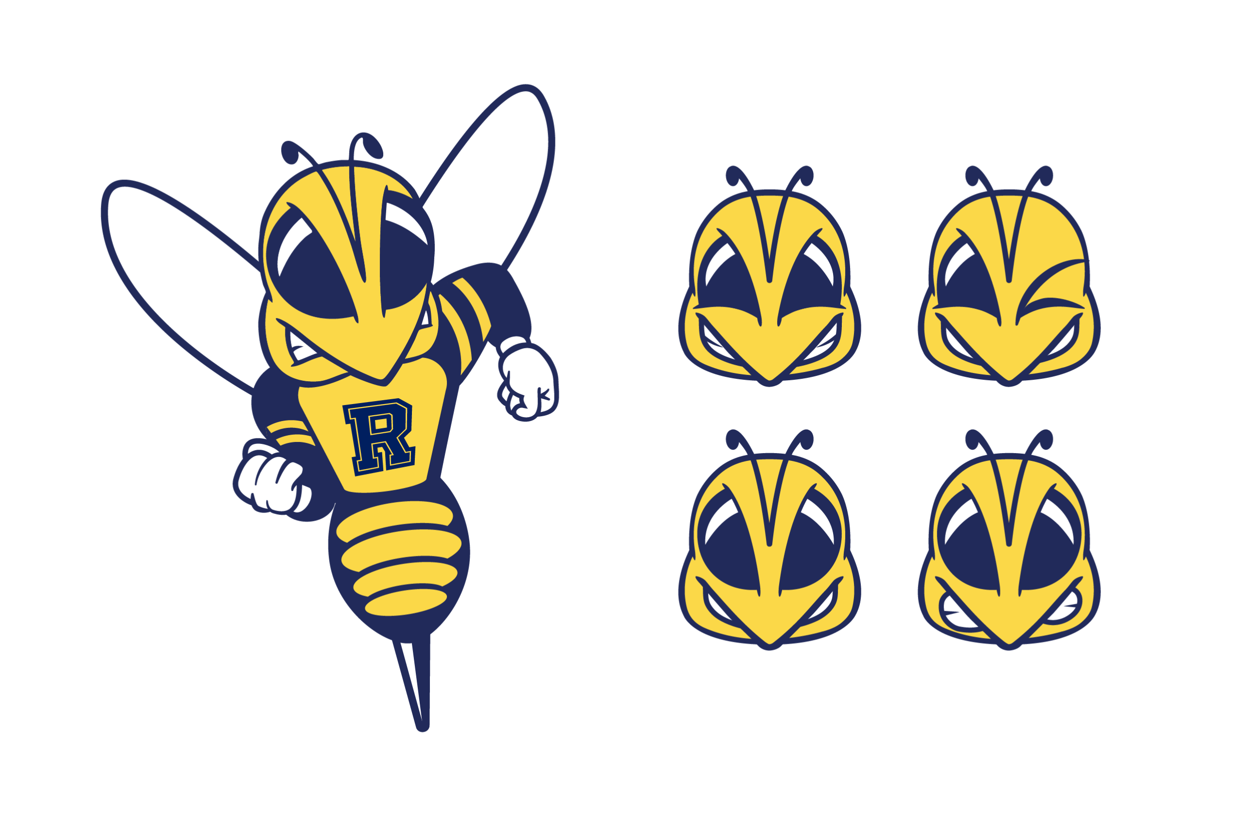
The mascot, Rocky, remains largely the same, but he was given some new emoji-like faces to give people more options.
Zawacki emphasized that the University’s brand campaign is mostly aimed at restructuring the school’s digital presence; physical signs will only be replaced on an as-needed basis.
“We’re digital first really with this effort,” she explained. “And our goal is that if there’s ever a sign that had to be replaced because it was falling over, then we would replace it with a new [one].”
When asked, Page Hetzel declined to say how much the project cost the University, but did share that the new campaign utilized some research from external firms but had been done primarily in house.
Prior to the branding’s release, some students had speculated online that the University was rebranding in response to the University of Richmond filing for a trademark of “UR,” a notion which Hetzel dismissed.
Hetzel explained that the school had not “lost” the “UR” trademark, adding that she thinks, “‘the why’ is trying to unify the University and to put effort towards elevating the reputation.”
While the University and Eastman have changed some of their logos and wordmarks, it is unclear if the Medical Center will follow suit.
The Medical Center continues to use the “UR Medicine” wordmark as well as the old logos on its website.
Associate Vice President for Public Relations and University Spokesperson Sara Miller explained:
“The University’s academic health system plans to align to the new visual style in the future,” she said. “As URMC and UR Medicine explore an alignment to the University’s brand refresh, more updates will be provided in the future.”
Miller did not explain whether or not URMC’s continued use of the ‘UR’ wordmark would conflict with that of the University of Richmond’s.
Other unchanged elements include the school’s name, “University of Rochester.” However, a secondary and optional “URochester” name has been added, to be reserved for less formal settings.
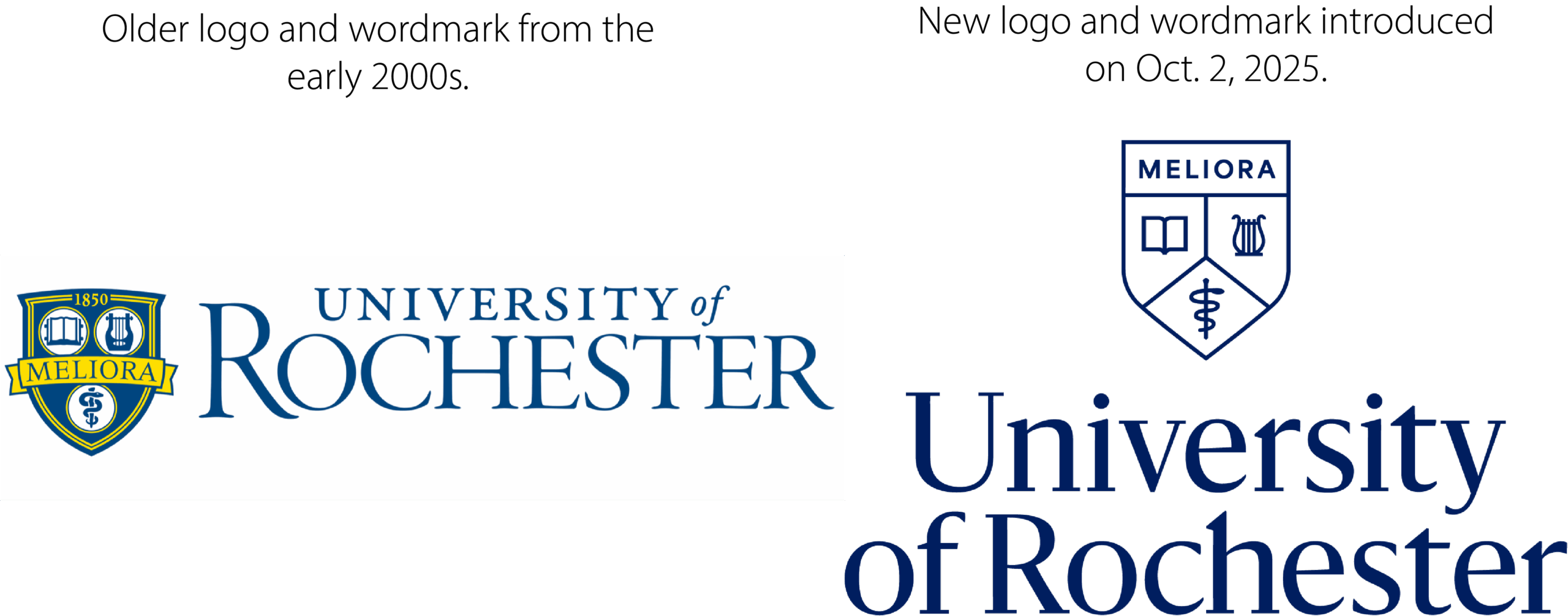
New logo (right) and old logo (left).
What students think
Some students on campus have shown mixed feelings about the new logos. Zawacki explained that, throughout the research process, the University had polled and taken into account the opinions from focus groups with students and alumni, and she said they had received positive feedback about the new changes.
However, not everyone is pleased. Sophomore Landon Spears shared his thoughts on the new redesign.
“I think they made the new logo a little worse,” he said. “I’m not outraged about it, like other people are, but I don’t know why they did it … I think there are more pressing issues than changing a logo.”
Senior Duc Vu feels that the change is not appropriate for the University.
“It’s kind of too minimal,” he said. “Maybe that’s what’s trendy nowadays, but personally, for something that represents a university, it feels too simple and bland.”
A “Change.org” petition calling for the school to “remove the new Minimalist seal from anything related to the University of Rochester” has accumulated over 1,000 signatures.
Faculty, staff, and students are invited to learn more about the University’s new branding strategy during “Brand Camp Zoom Trainings and Open Office Hours,” which are listed on the school’s website.

