The morning of Oct. 3 started off normally. Students woke up, went about their daily routines, and opened Instagram.
“Today, we’re proud to launch a refreshed brand identity,” the official @urochester account exclaimed. “Ever Wonder. Ever Better.”
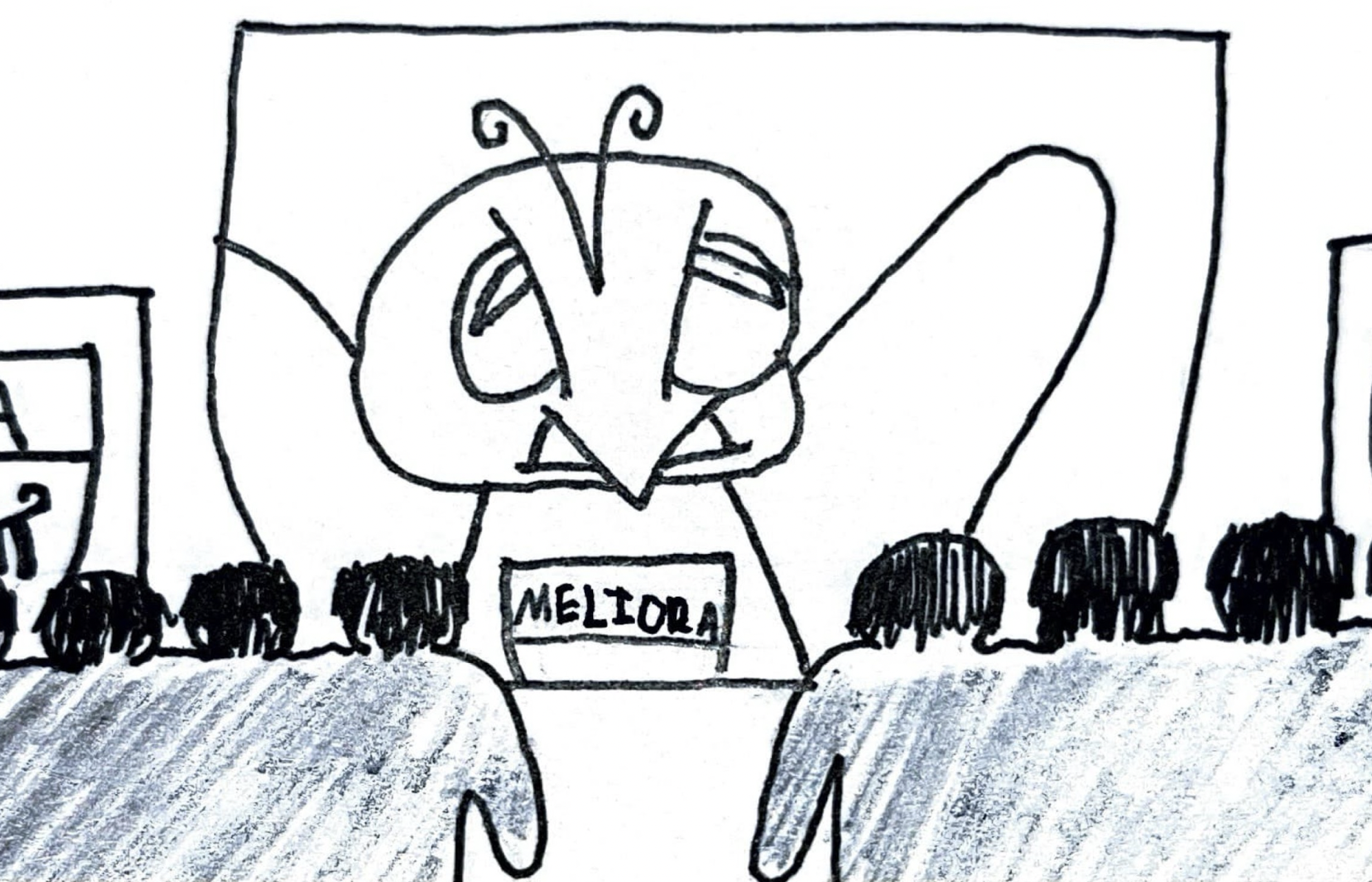
We were stunned. The charming logo had vanished. Our distinctive Yellowjacket blue-and-gold was gone. The classy “Meliora” ribbon had been replaced by a text box featuring a strange monoweight font. Our university symbols (the Rod of Asclepius, a lyre, and an open book) had practically been simplified down to emoticons. In short, the new logo was minimalist. The University had followed the unfortunate lead of Cracker Barrel, Pizza Hut, and many other institutions over the past decade. Later that morning, Gavin Rice ’25E and I started a Change.org petition to reverse the changes. Students, faculty, and alumni responded enthusiastically, with over 1,300 signatures as of Oct. 26.
The University Communications page introducing the “refreshed” brand declares that “The world is always changing, so we’re laser-focused on making sure our brand evolves right along with it.” If the University is indeed seeking to keep pace with an ever-evolving world, then why choose minimalism? Minimalism is already becoming dated!
According to professional logo designer Lance Reis, “the current wave of corporate debranding can be traced back to … 2012.” Countless corporations and educational institutions (Dunkin’, Pringles, Norwich University, etc.) have simplified their logos since then. But with so many institutions choosing minimalism, Reis said, the style no longer stands out. As such, the world has already begun to pivot away from minimalism — Cracker Barrel’s recent logo debacle and the outstanding response to our petition serve as proof of this.
Minimalism aside, the new logo features clashing typefaces. Our logo has two components: the Meliora shield and the “University of Rochester” text (known as a wordmark). In the old logo, the words “Meliora” and “University of Rochester” were in one font, Garamond, creating a unified look. In the new logo, however, they are in two different typefaces. As RIT graphic design major Mira Altersohn points out, “University of Rochester” is in “a nice serif typeface,” while “Meliora” is in “a monoweight type which doesn’t match at all.” In short, the new logo looks “unfinished”: unable to commit to one style, it is uncomfortably reminiscent of AI-generated art.
Most importantly, however, is the question of whether the University community was truly an “integral” part of the redesign. The Communications website proclaims that the initiative, which took two years to complete, was based on “authentic feedback.” It then addresses and thanks the “hundreds of students, patients, faculty, staff, providers, friends of the University, [and] thousands of alumni” involved in the logo change process. However, many faculty and students have complained that they were not part of the decision. Indeed, we have not been able to identify anyone who was consulted by the University about the rebranding!
If the University did ask us for feedback, they did not do so to nearly the extent they should have. We would have preferred to have a public voting process. When American Airlines rebranded in 2013, for example, their employees were asked to vote on whether they preferred the new livery or the old one. As one UR alumna has commented, “[A] decision of this magnitude should reflect the collective voice of our students, alumni, faculty, and staff, not solely the perspective of a marketing team. The University’s logo … deserves input from the full community it represents.”
But isn’t this a big fuss over just a rebrand? After all, according to faculty, the University administration believes we are “change-averse.” Aren’t there other issues we should be concerned with?
While the school does have other problems, the timing of the rebrand worsens them. We question the reasoning behind implementing a costly redesign while the University is suffering from unprecedented federal budget cuts. A July letter from the Provost confirms this: “[R]ecent disruptions in federal funding present real challenges to sustaining and expanding our areas of strength. To date, we’ve seen just over 30 federal grants terminated … resulting in a current net loss of approximately $9 million from our nearly $500 million annual research portfolio.” Even if the redesign has indeed been planned for years, this is simply not the time. As we are actively losing millions in research funds, we are probably spending undisclosed sums replacing every logo across all of our campuses!
At the same time, the University is ending lifetime email access for alumni Nov. 4, giving users about a month’s notice to switch. To quote a signer of our petition, “Unreal that the University has the budget for a rebrand that no one asked for, and chooses to take down all alumni email access at the same time.”
While a logo design is indeed small in the grand scheme of things, it is equally true that the new “digitally friendly” look does not adequately represent the University. “To truly be ever better, we must be on the cutting edge and not in the middle of the pack,” Col Raimond, Director of LGBTQ Life, says in reference to the University’s 2030 Strategic Plan, which includes the rebrand. By belatedly implementing a minimalist logo over a decade after the trend began, we are definitionally placing ourselves in the “middle of the pack.” Elsewhere, the University proclaims that “Our refreshed brand provides a more compelling representation of the rigorous education and groundbreaking research … that have been our cornerstones for nearly two centuries.” If our education is truly rigorous and open-minded, should not the design process have reflected this? Should it not have better included the generations of alumni who are helping us through our financial struggles by donating to our For Ever Better fundraising campaign? We are not “change-averse”: We simply desire ever better change.
