COVID-19 news is dominated by numbers. Number of active cases, number of total cases, number of deaths.
So you’d think that the University would want to communicate these vital statistics to us.
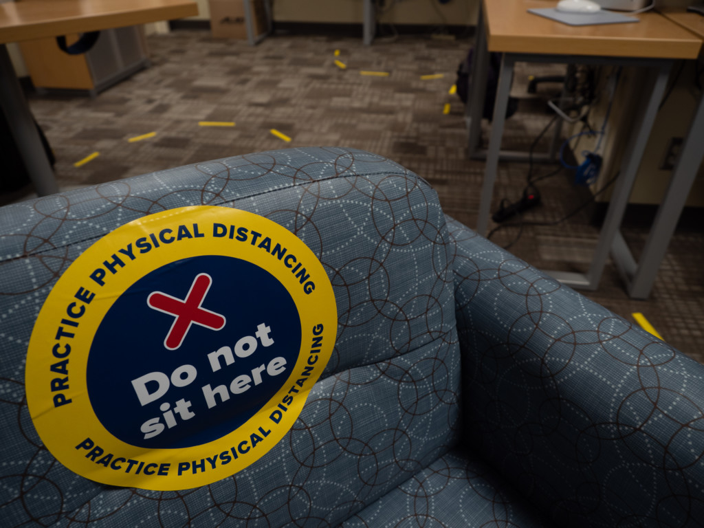
The University spent so much money on their URCommitment social media campaign, and generally did a great job bombarding our campus with visual reminders to stand here in Starbucks, sit here in iZone, social distance when walking through Hillside Market.
But they really dropped the ball with the biggest incentive to adhere to COVID-19 rules: the numbers. As students who risked catching COVID-19 to attend school in person this year, the last thing we want is for cases to climb, especially because New York Governor Andrew Cuomo requires that schools with 100 cases switch to remote learning for at least two weeks. The biggest weapon at UR’s disposal right now is accurately and loudly reporting cases to the student body.
But the “Confirmed Cases” webpage, currently being used to track positive cases, is an eyesore at best and incomprehensible at worst.
It’s unnecessarily difficult to figure out how many positive cases we’ve actually had. For example, the webpage simultaneously reports five new cases since Aug. 1 and three new cases since Sept. 26, without clarifying whether that adds up to eight cases total. Where does one time frame begin and end?
A much clearer and neater way to convey these new cases would be through a visual timeline, rather than hastily thrown together bullet points. How can we flatten the curve if no curve is displayed?
The University’s “Confirmed Cases” page links to a database from New York State about the University’s cases specifically. That database provides some new information, but is also confusing.
It does clarify how many students are quarantining, what the remaining quarantine capacity is, whether they’re quarantining on or off campus, and how many tests are done in a certain day. But those numbers seem to lag behind the data on the University’s dashboard, and while the graph of testing claims to highlight positive tests in yellow, it doesn’t actually seem to highlight them.
While we understand the need to protect patient privacy, the information provided about any given positive case is incomplete. When a new case is reported, it’s impossible for students to know whether that person had been living on or off-campus, or whether they’re a River Campus or Eastman School of Music student. The University just won’t tell us.
For a renowned research university with a robust school of Engineering and applied sciences, we assumed they’d be better at data presentation. We should not have to read between the lines to know how safe our University is.
It’s really not that hard for UR to communicate this info in a clear, straightforward manner. For example, don’t bury the number of new cases among other, unrelated information, like the Oct. 1 @Rochester email did.
We want the number of new cases (as well as the number of active cases and total cases) at the damn top. For that matter, these statistics should also be in the subject line or the email preview, since many students just ignore the @Rochester emails popping into their inbox every day.
It’s ridiculous that the Oct. 1 email preview doesn’t mention that there’s a new positive COVID-19 case. Instead, it reads: “COVID-19 and the common cold; academic journal focuses on curbing violence against women in India; student resume workshop.”
We’re sure the University would rather advertise their faculty’s research accomplishments, student initiatives, and other things that make UR look good, but don’t you think it’s more important to emphasize that a student has tested positive, even if that makes us look bad?
Here’s a suggestion: have the header of every @Rochester email include a COVID-19 case tracker, listing the number of new cases in the last 24 hours, as well as the total number of cases since Aug. 1. Or make it an eye-catching graphic if you want the headlines to highlight faculty. Just put something in there to let students know how much risk is floating around on campus.
The editorial board spends a lot of time complaining about the University’s mishandling of student issues, and for the most part, that’s warranted. But we hope never to undermine the role that students must play. Even if the University’s system for reporting COVID-19 cases was perfect and completely intuitive, caution would still be imperative.
Even if every on-campus student regularly and honestly filled out their Dr. Chatbot, some cases would be bound to slip through the cracks. Some of us might be asymptomatic carriers, or have symptoms but not recognize them for what they are. There’s no way to know for sure how many cases we actually have.
So fulfill your responsibility, especially because the University isn’t fulfilling theirs. Those blue and yellow circles on the ground at Starbucks and the Campus Mail Center aren’t suggestions. Respect people’s personal space, especially while standing indoors and breathing the same air as they are for upwards of 10 minutes.
Keep up-to-date with what’s going on.
And keep asking the University for answers.
The Editorial Board is a weekly Opinions article representing the view of the Campus Times, co-written by Editor-in-Chief Hailie Higgins, Publisher An Nguyen, Managing Editor Corey Miller-Williams, Features Editor Micah Greenberg, and Opinions Editor Lucy Farnham.
