To gauge students reactions to the various logos being considered for the new face of the University, about 70 students, administrators and staff members convened in the Gowen Room for SA President Alexander Pearlman’s first Town Hall meeting.The meeting featured a presentation from Vice President for Communications Bill Murphy.
“My first take of the student reaction was high energy, which is good, it is one of the things we’re looking for,” Murphy said. “What you want in the final product is a good, strong reaction to it, it should say something, but it should also evoke emotion.”
Last semester, with the hiring of Murphy, came the charge to work on the communications at UR. Part of this greater effort to improve communications is the redesign of the University’s graphic image.
The first step in creating a new graphic image is making a new logo. A group of 28 people from all over the university joined together with designers to begin this process.
Over the summer, 10 designers from UR came up with 70 different designs that were viewed in Sage Art Center.
After the first review, the designers went back and made 229 designs that were viewed in the May Room. They were then narrowed down to the 12 designs being viewed now.
“From viewing all of the logos we decided our new logo must be distinctive, dignified and serious,” Murphy said in his presentation. “It needs to say we are a world-class research university.”
Murphy’s slide presentation to the audience included all of the history behind the decision to create a new logo, the steps that have been taken thus far, and what still needs to be done. He ended with a slide show of the current potential logos in their color and black and white forms.
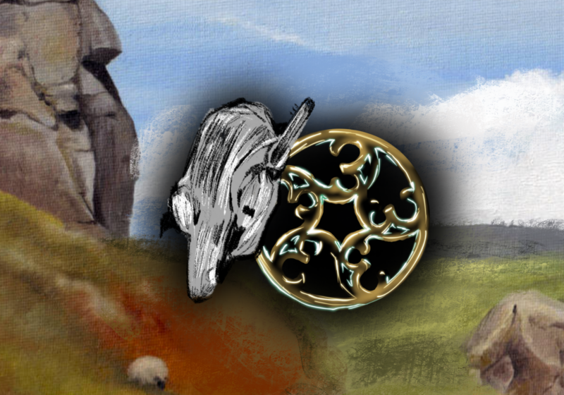
The logos were different combinations of fonts, capital letters and lower case, “University of Rochester,” and just plain “Rochester,” yellow and blue and variations of a UR shield.
Once the presentation was finished, Murphy opened up for comments on the potential logos and hands shot up in the audience. Comments ranged from ideas about specific logos to the entire logo concept. They debated the placement of the dandelion, the Rush Rhees tower, and the University coat of arms.
“Most of the comments were frankly negative,” Murphy said. “Most of the comments about the dandelion, the UR graphic, or the tower were negative. People are a little more positive about the shield or the coat of arms. There is a sense that it really needs to be something classic – people feel that way about the icons and the typefaces. They also want something that’s relatively straightforward.”
All of the comments made by students were taken down to be reviewed. In the next few weeks Murphy will be doing his presentation for other groups and recording their input as well.
“From the feedback we’re getting I know we have to go back to the drawing board,” he said. “We’re going to have to do a lot of work on refinement, some tweaking and maybe creating some new images.”
However, coming up with a logo and a new graphic image, as well as receiving feedback from all over the University is very important.
“A graphic identity is one of many ways that we highlight we are one University, united in our common aspirations and achievements,” UR President Joel Seligman said. “The best way to select a common graphic identity is to consult every constituency and listen to their views. No ultimate decision will be made until every relevant constituency has a chance to speak.”
Murphy agrees that getting everyone’s feedback is essential.
“We remain a lot more true to who Rochester is if we listen to all the different voices,” Murphy said. “Also, people are much more likely to use the new identity system and then what comes with that coherence and consistency is the power of the logo.”
According to Pearlman, students should make themselves a large part of the decision making process.
“Right now, students can provide a forum for feedback,” he said. “Further down the line, students can use the graphic identity manual in their publicity and be part of creating a unified image.”
But these logo feedback sessions are just the beginning of the process to create the full graphic image for UR. The current timeline for the graphic identity projects that it to be finished by Sept. 2007. By Dec. 2006 the logo is expected to be finished. From Dec. to next Sept. the full identity system will created.
“This process should be very important to everyone,” Pearlman said. “The quality of this image is going to affect our future jobs and our degree.”
Murphy echoed Pearlman’s excitement.
“A lot of people around the university really believe that if we do this right it can be of real use,” he said.Jarrett can be reached at bjarrett@campustimes.org.